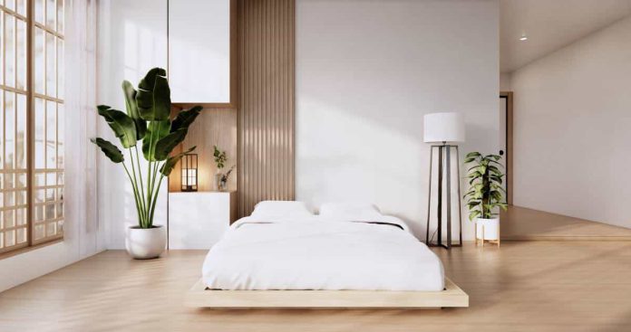
jordlinghome.com – The minimalist concept has clean lines and a simpler impression. A calm atmosphere can make the house feel more comfortable. And, to maintain calm in the room, minimalist designs tend to use neutral colors such as white, beige, black, gray, and brown. However, the weakness of this minimalist design is that it feels stiff and boring due to the use of very minimal furniture and decoration. However, all of this can be avoided if you can decorate your room well and correctly. And, in this article, we have provided 23 Minimalist Room Concepts That Still Look Stylish. So, let’s check it out!
1. Centralized Decoration
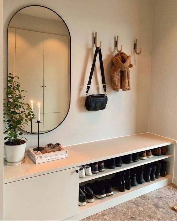
Carrying out centralized decoration will really help to maintain a minimalist concept in the room. So, the other side functions as it should, the other side is made plain, and the other side becomes an interesting spot that enhances the appearance. That way, even though the room seems very minimalist, this does not make it look stiff and boring.
Decorations in the room also cannot be haphazard. There are several aspects you should pay attention to, such as color, design and size. The oval mirror is perfect for filling an empty wall in the corner of the mudroom. With a black frame, the mirror manages to look bold and stand out in the room. Candles, books and plants are additional decorations that make the mirror on the wall more aesthetic.
2. Dominant of White
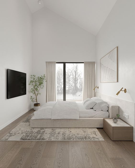
If you have to choose one color as the main color of the room, then white is the safest color for you to choose. This color can neutralize the appearance of the room so that other colors and textures there appear more clearly. White also helps in lighting up the room. With the help of sunlight, white will look brighter and more alive.
The application of white on the walls, ceiling and bedding shows a consistent color application. Dark corners in the room disappear so the room feels more spacious. This method is most appropriate for use in small rooms.
3. Apply Scandinavian Design
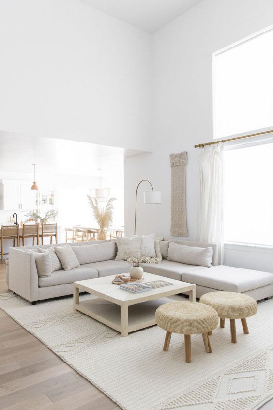
This Scandinavian living room has a natural look with white dominating. The gray sofa gives a slightly cold feel there. However, you can still feel the warmth in the room with the beige color, fabric material, and maximum natural lighting.
To maintain a minimalist appearance in the living room, all sides are made plain without patterns. Also, the color of the throw pillows is made the same as the sofa, thereby reducing the use of color in this room. Even so, this living room still looks stunning by playing with texture. The rug has a very good pattern texture. Also, wood material provides a natural texture to the room. And, all these textures are clearly visible with the help of sunlight coming in through the large windows.
4. Floating Table for The Entryway
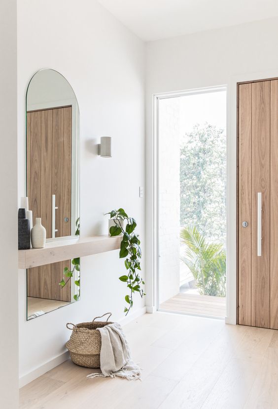
The entryway has a big influence because this is the room that makes the first impression when you enter the house. So, making it look attractive is a must. No need for excessive decoration, just decorate the entryway with a minimalist concept for a sweeter impression. A floating table is a great option. You can fill the bottom area with additional decorations such as basket wicker.
A plant, even if it is small, can create freshness in the entryway. And, in the middle area of the wall, there is a long mirror without a frame. It is good to maintain the minimalist concept of the room. Also, having a mirror really helps to brighten up the room.
5. Plain Kitchen with One Color
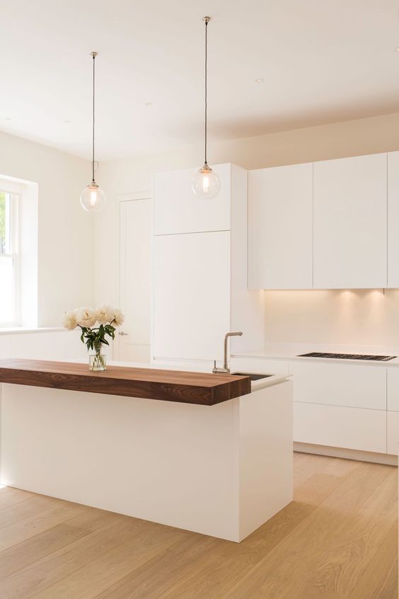
The kitchen has a pale appearance, but it is a good way to apply a minimalist concept to the kitchen area. The color of the kitchen cabinets and the color of the walls are made the same to reduce the number of colors in the room. But, if you want to bring another color to the kitchen, then rely on wood material. It will present a natural brown color to the kitchen.
The play on lighting on the backsplash provides a beautiful accent. Yellow lighting brings warmth which makes a minimalist kitchen feel very calming.
A little decoration is a solution to eliminate the stiff impression of a minimalist concept and a dull appearance. Two pendant lamps hang right above the kitchen bar. Also, there is a small vase containing white roses as a refresher which adds to the beauty of this minimalist kitchen.
6. Natural Minimalist Small Kitchen
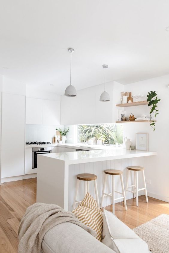
The bright appearance of the kitchen is obtained from white as the main color. Also, there is a window that becomes a backsplash. This is where natural lighting comes from to illuminate the small kitchen. It is good to make the white even brighter and also provides a wider effect. That way, the comfort of the small kitchen will increase.
There is no need for excessive decoration because the white color and natural lighting are enough to beautify the room. Also, the view seen from the window is of interest. Just needs a few more touches, such as floating wall shelves with several displays and plants in the corner of the room.
7. A Built-in Cabinet is The Best Option
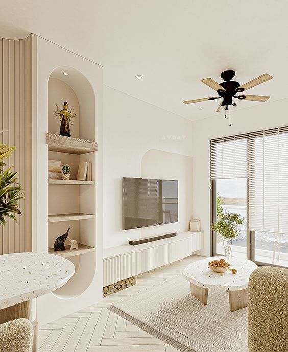
The built-in shelves are the best solution for the living room. To maintain the minimalist concept, you have to minimize the use of furniture in the room. And, the built-in shelves can replace a rack or cabinet table as an interesting spot. The built-in shelves will blend with the wall so it does not look like additional furniture there. Also, its position does not take up space which can make the small living room feel cramped.
Make the built-in shelves stand out by providing special lighting there. Yellow light is a good way to make it feel warm and calm. Use wooden shelves to give a natural impression. And, paint the inside of the built-in shelves brown for an even more attractive appearance.
8. Beige as The Main Color
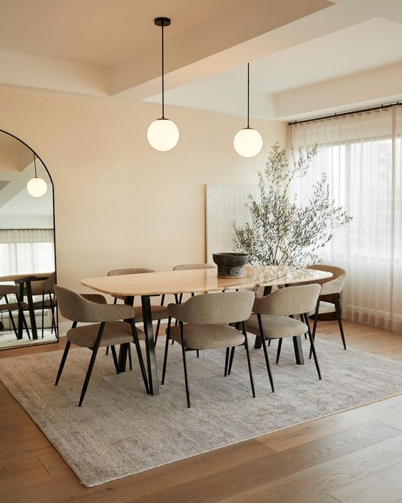
If you are bored with white as the main color, then beige is the right color to replace white. The dining room with beige nuances has a soothing ambiance. Coupled with minimal decoration, it feels very comfortable. The natural elements present bring freshness, warmth, and tranquility which makes this room the perfect space for gathering.
There are no special decorations in this room. Everything is made simple. The beauty only depends on the gray rug and also the mirror that is just propped against the wall.
So that the beige color in the room looks lively and warm, two pendant lamps with yellow lighting are used which are hung right above the table wall. And, to keep the appearance of the room from being too bright, the window area is decorated with sheer curtains.
9. Playing with The Pendant Lamp
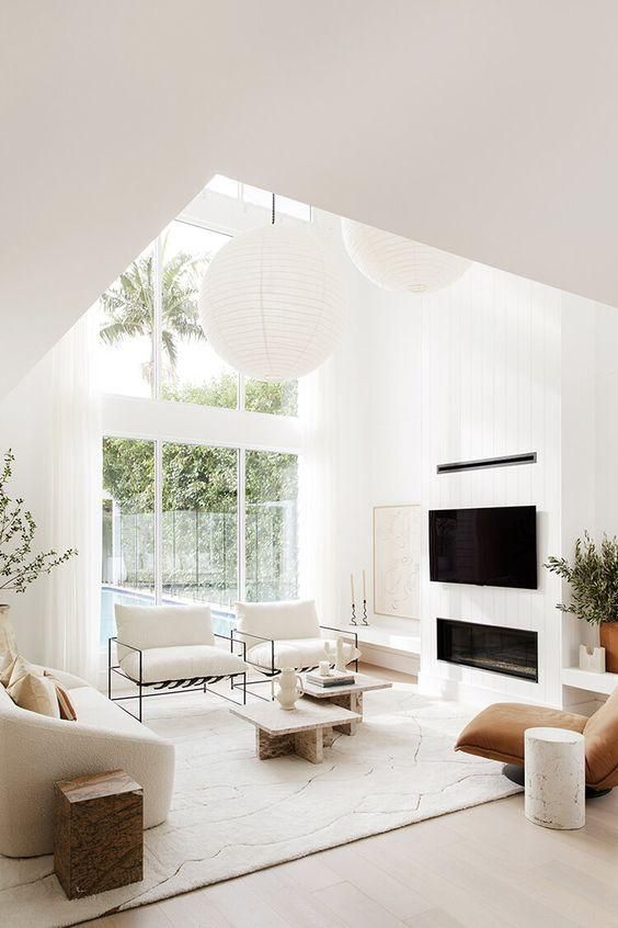
Because you can’t use too many items or decorations in a room, you have to be able to use items that really need to be there. Still choose furniture and decoration with a minimalist design. And, bring beauty by playing with the lamp design. Use large lamps so that their presence is not only a source of lighting in the room but also a decoration that makes a minimalist room look aesthetic and attractive.
The large white lanterns of different sizes are hung at different heights too. The color is the same as the walls, making it balance with the interior. That way, harmony in the appearance of the room can be maintained very well.
10. Simple Reading Nook but Still Cozy
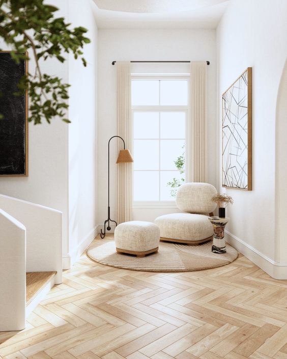
The sofa with its unique design makes this small reading nook successful in attracting attention. The couch used does not have rigid corners so the appearance of the reading nook is softer. In the lower area, there is a round rug which is a visual barrier to the reading corner. In the corner of the room, there is a floor lamp for lighting at night. On the left side of the couch, there is a coffee table with a touch of black which makes it look like it stands out there. The walls are only decorated with a painting with a white base color. And, the final, natural lighting in the reading nook is maximized.
11. A Touch of Bold Black
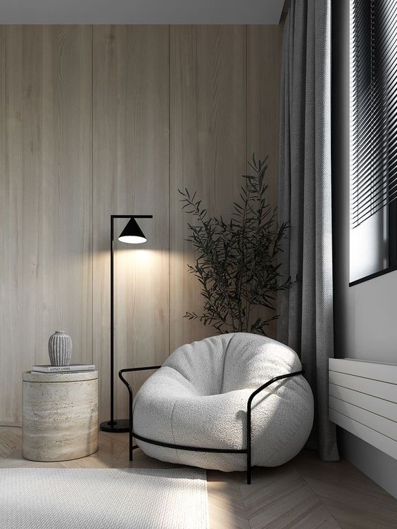
The corner of the room is used as a minimalist reading nook. The wooden walls and wooden floors provide natural wood textures and motifs. This is enough to beautify the corner area of the room. However, the natural impression becomes bolder with the large plants behind the couch.
Choosing gray for the couch and another wall side is good for making the look of the corner room shadier. That way, calm can envelop the corner of the room. Reading will become calmer. It’s just that you need a little touch that can give a firmer effect to eliminate the pail impression here. You can add a touch of black to the sofa frame and floor lamp.
12. Mirror without Frame
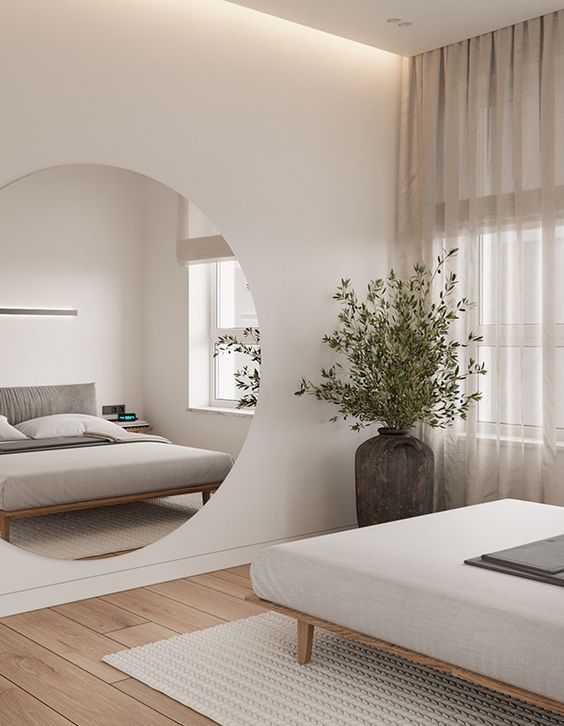
Compared to using quite a large number of wall displays, it would be better to use just one display, but the size tends to be large. This is a trick for maintaining a minimalist concept in the room.
On one side of the wall in this minimalist bedroom is hung a round mirror without a frame which makes it look like it is integrated with the wall. Choosing an area exposed to direct sunlight is very good. Mirrors have the property of reflecting light. So, when sunlight enters through the window and hits the mirror surface, the light will reflect into the room. That way, the room becomes brighter.
13. A More Shady Appearance
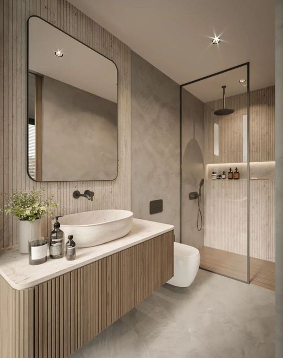
The walls in this bathroom are not painted at all. The colors in the room are the result of the concrete and wood materials only. The concrete walls and floor bring a natural gray color to the room. And, the brown color comes from timber for the walls and vanity.
Timber installed vertically provides a beautiful accent on the wall. This also gives the effect of higher walls and makes the small bathroom feel more spacious.
To maintain a shady appearance and calm atmosphere in the bathroom, lamps with yellow lighting are the most appropriate. The help of natural light coming in through the windows makes the colors and materials there become more alive.
14. Purge All The Clutter Under The Vanity
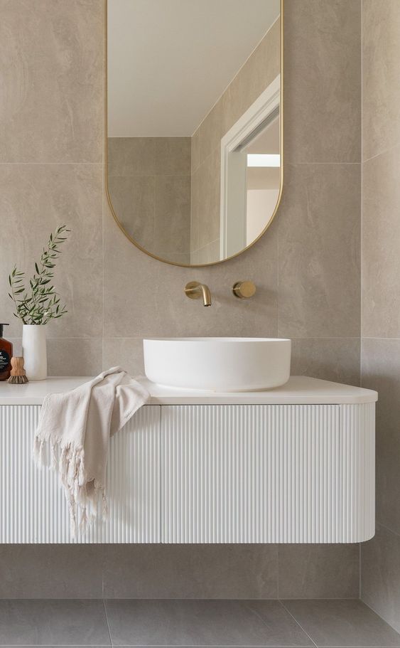
The vanity area is often a storage area. The shelves are filled with towels, tissues, and other bathroom stuff. And, this is an important point to pay attention to when applying the minimalist concept to the bathroom.
The floating vanity is a good way for the minimalist bathroom. The bottom area can just be left blank so it does not cover the wall too much. This also really helps the bathroom seem more spacious.
15. Playing The Existing Items in The Room
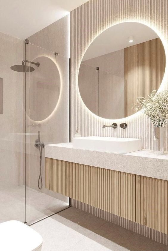
Maintaining a minimalist impression in the bathroom, you are not allowed to add more decoration or items in it. So, play with the items already in the room. Give special touches that can make the item look beautiful and aesthetic there. Like in this bathroom which uses a round mirror in the vanity area as an interesting spot. Behind the mirror, an LED light with yellow lighting is installed, which makes it appear attractive and not too dazzling. It is also a great decoration for the mirror without frame. The light from the LED will follow the shape of the mirror and create a beautiful accent there.
16. Small Minimalist Workspace in The Corner of The Room
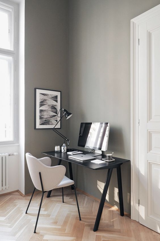
Instead of leaving the corner of the room empty, it would be better to use it as a comfortable work area. You can create a workspace there. Use a table with a minimalist design. A black table is a good choice. It can look bold in the corner of the room and attract the eye. Accompany the table with minimalist design chairs too.
Do simple decorations in the workspace. The black table lamp will look match there. And, fill the wall area with a painting. The black frame separates the painting from the wall.
17. LED Light for A More Dramatic Gaming Room
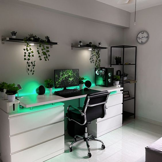
This minimalist gaming room relies on three neutral colors, namely white, gray and black. Gray as the main color to create a more shady look. That way, the atmosphere created in the room is more calm. However, the white workspace table manages to give a bright and lively impression to the room. And, black is an accent that gives a firm impression there. The scattered application of black makes it look stand out in this room even though the amount is small.
What makes this workspace look dramatic and stunning is the LED light behind the table. LED light with green light makes this room look different. Extend green to other decorations such as plants. You can place the small plants in the workspace.
18. Minimalist Black Gaming Room
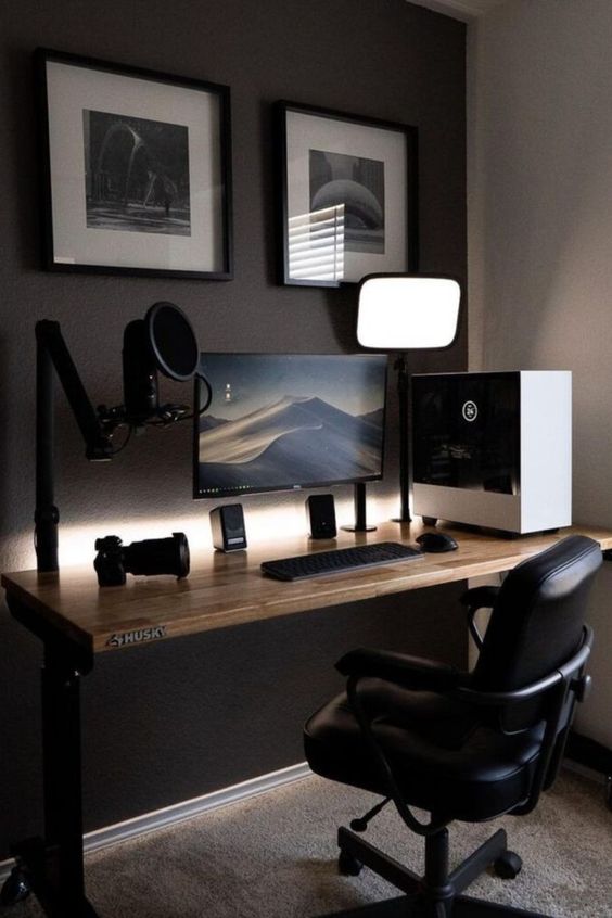
The soothing of the room comes from the dark appearance. Black is the main color in this room. However, some of the walls are painted in grey. Gray carpet was also chosen for the floor, thereby minimizing the choice of colors in the room. That way, the minimalist concept can be maintained very well here.
You can fill the workspace with colors that match the interior, that is black. So, make the black system here. Choose a black stool, mic stand, earphones and table lamp. Finally, use LED light with yellow lighting to brighten up the gaming room but not disturb the shady appearance itself.
19. Simple and Cozy Home Theater
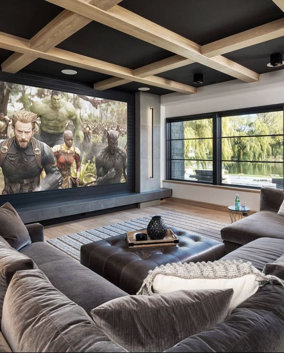
This home theater feels so cozy with a large minimalist sofa design. The gray color of the couch brings a shady look to the home theater. However, this does not make the room dark. White remains the main color in this room. Also, the large windows are not decorated with any decoration so that natural light enters the room freely.
Even though there is no special decoration in this room, the Chesterfield coffee table adds to the appearance of the room. Also, beams on the ceiling follow to enliven the room. The black ceiling makes the room not seem too big so you can feel comfortable without feeling empty.
20. Pretty Attic Bedroom with Natural Wall Accent
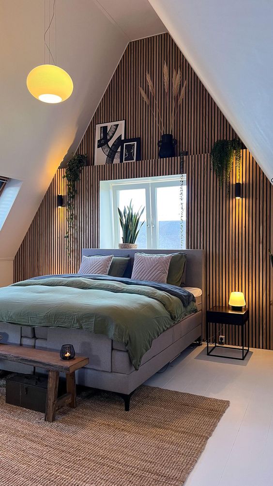
The limited space in the attic bedroom requires you to minimize the use of items. For the attic bedroom, you can fill it with a bed and a bedside table. For decoration, take advantage of the wall area. That way, you can maintain the appearance without taking up the space in the room which can make it feel cramped and uncomfortable.
Timber installed vertically gives a high effect on the walls which is good for the attic bedroom. It can make this bedroom feel more spacious. And also, timber provides a very beautiful natural accent. Maintain a natural impression in this room by adding several small plants there. Install black sconces with yellow lighting which can help wood in warming the room.
21. Marble Bring Another Look into The Minimalist Kitchen
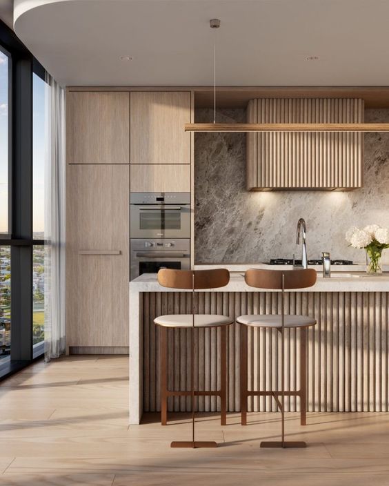
Even though it is minimalist and very simple, this kitchen still looks attractive with marble. The marble is installed on the backsplash. The gray color with a hint of black makes it stand out in the room. Also, the help of light from spotlights makes the natural motifs on the marble appear more clearly. Yellow light increases warmth and calm in the kitchen.
Besides beautifying the appearance of a minimalist kitchen, the presence of marble also creates an elegant impression in the kitchen. So, it is good to minimize the decoration in the room. That way, the colors and motifs on the marble can monopolize the eye’s attention in the kitchen.
22. Minimalist Kids’ Bedroom
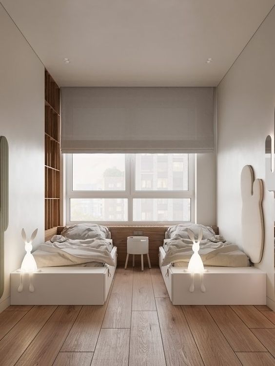
Two beds are good for the minimalist kids’ bedroom. You can use the same bedding for the beds. That way, the minimalist impression can be maintained very well. However, pay attention to the other side of the room. For the headboard, you can install string lights or LED lights which can beautify the appearance of the bedroom at night. For the walls, provide a beautiful accent using fabric material.
23. Full of White
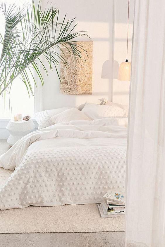
Never hesitate to use one color in a room. Here, you can rely on white. The white color will create a natural bright impression in the room. Moreover, if natural lighting is the main lighting.
The consistent application of white can be seen in the walls, curtains, bedside table, and layered bedding. There are no motifs present in the room to maintain a minimalist impression. However, playing with textures really helps to cover up the stiff and boring impression in the bedroom.
If you want to use decoration in this room, then plants are the most appropriate. The natural green color of the plants will not disturb the white concept of the room. In fact, the green color of plants creates freshness in the room.
Final Words
A minimalist concept that is full of calm is what people are looking for. Many of them apply a minimalist concept to make the room feel comfortable. However, one of the drawbacks of this concept is that it looks boring and stiff. However, this can all be resolved if you can decorate the room very well. The points above are 23 Minimalist Room Concepts That Still Look Stylish you can follow. So, good luck!

